How to make a Vue Modal component from scratch
How to make a Vue Modal component from scratch
Modals are a scripted effect that allows you to display a small element over a website, be it an image, form inputs or text information depending on the use case - we’ll discuss these a little later. The point is modals are great! The biggest benefit of modals is that they avoid the need to use conventional window pop-ups. In short, modal dialog windows are a means to quickly display information to users on the same page they are working on, creating a better user experience for anyone accessing your website and decreasing annoyingly unnecessary page reloads.
We usually have to place modals on our web pages when faced with one or more of the following scenarios:
- Warnings — When we have to warn the user of something that could be potentially harmful to them.
- Errors — When we want to alert the user of an error.
- Information — When we want to highlight very important information to the users.
- Decisions — When we want the user to confirm a decision i.e confirm or decline.
- Data collection — When we want to collect data from the user with the help of a form usually.
The list is not exhaustive as modals can be used in so many other ways.
Today we’ll use Vue.js, an increasingly popular JavaScript framework to create a simple Modal to collect data with. We’ll then use a product called Bit to make the component easily reusable and help us share this component with others.
Before we begin, make sure you have the following installed on your device:
Once you’re done checking that list, we need to install Vue on our device. We do this with this command npm install -g @vue/cli . When the installation is done, we need to initialize a new Vue project with the following command vue create bitmodal — we’ll name our project bitmodal. We then have key incd bitmodal to the terminal to change directories. You’re VS Code should now have a few new files created, key in yarn serve and you should see the usual Vue boiler plate.

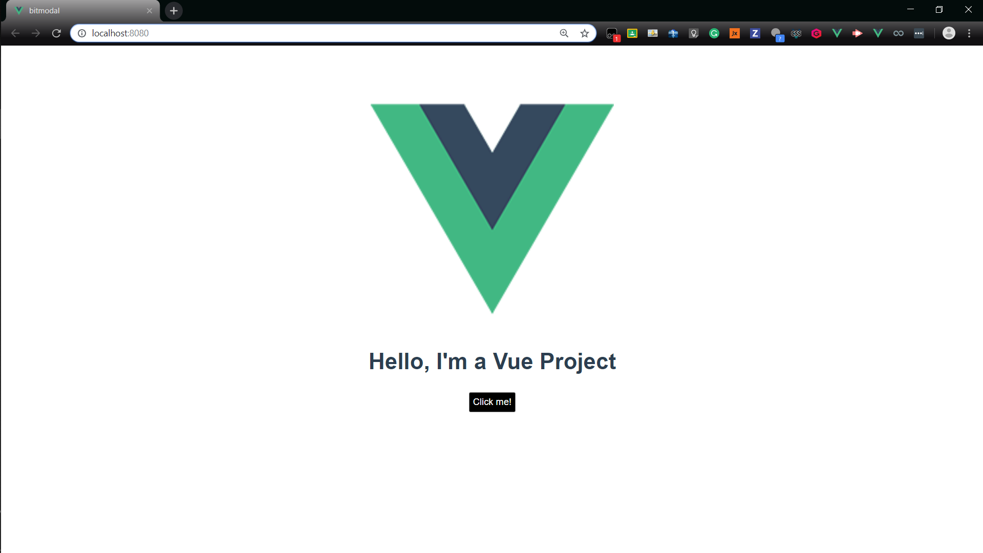
We’ll be met with the standard Vue project layout. Next, we edit the App.vue file to make it have the modal component we’ll add later on. Your App.vue file should look something like this.
<template>

<div id="app">

<img width="25%" src="./assets/logo.png" />

<h1>Hello, I'm a Vue Project</h1>

<button class="btn" @click="showModal">Click me!</button>

<Modal v-show="isModalVisible" @close="closeModal" />

</div>

</template>


<script>


import Modal from "./components/Modal.vue";


export default {


name: "App",

components: {

Modal

},

data() {

return {

isModalVisible: false

};

},

methods: {

showModal() {

this.isModalVisible = true;

},

closeModal() {

this.isModalVisible = false;

}

}

};

</script>


<style>


#app {

font-family: "Avenir", Helvetica, Arial, sans-serif;

-webkit-font-smoothing: antialiased;

-moz-osx-font-smoothing: grayscale;

text-align: center;

color: #2c3e50;

margin-top: 60px;

}

.btn {

color: white;

background: #000;

border: 1px solid #828282;

border-radius: 2px;

margin: 4px;

padding: 5px;

}

</style>
What we did was add a Modal component to the main Vue application. The contents of this component can be edited in the Modal.vue file we create next. To trigger the modal, we use the “@click” vue feature which calls the function showModal() whenever that button is clicked and the modal opens.

Now we have to actually create the modal component, in src/components, you need to create a file called Modal.vue and paste the code below into it. This code just displays a message along with a button for one close the modal. You can find the code to the Modal.vue file as well as the whole project in the CodeSandbox of the project below.
Review
If you were paying attention, we’ve done the following:
- Created a Vue Application in CodeSandbox.
- Added and built a new Modal component to our Vue application.
Now you can build and share app components with ease ✨
Happy programming 👋
